Plotting means and error bars with significant difference
This is a brief introduction about how to plot means and error bars with significant difference, which is very commonly used in analysis of variance and multiple comparisons.
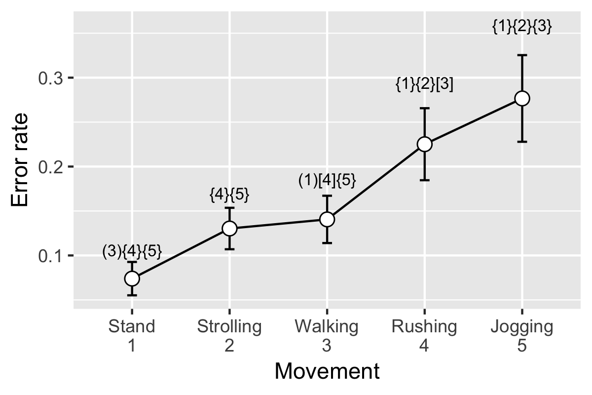
We will use the data of tapping error rate on the smartwatches’ screen when users in different moving speeds. That is, people tap the smartwatch in standing, strolling, normal walking, rushing, and jogging.
Needed libraries and functions
First, we need to include needed libraries, if you don’t have them in your computer, use install.packages() to install them.
library(ggplot2)
library(plyr)
Second, we need to include the needed function for summarizing data. This is a function that you can find in [http://www.cookbook-r.com/]. Just run the code if you don’t want to look into it.
## Gives count, mean, standard deviation, standard error of the mean, and confidence
## interval (default 95%).
##   data: a data frame.
##   measurevar: the name of a column that contains the variable to be summariezed
##   groupvars: a vector containing names of columns that contain grouping variables
##   na.rm: a boolean that indicates whether to ignore NA's
##   conf.interval: the percent range of the confidence interval (default is 95%)
summarySE <- function(data=NULL, measurevar, groupvars=NULL, na.rm=FALSE,
                      conf.interval=.95, .drop=TRUE) {
        library(plyr)

        # New version of length which can handle NA's: if na.rm==T, don't count them
        length2 <- function (x, na.rm=FALSE) {
                if (na.rm) sum(!is.na(x))
                else       length(x)
        }

        # This does the summary. For each group's data frame, return a vector with
        # N, mean, and sd
        datac <- ddply(data, groupvars, .drop=.drop,
                       .fun = function(xx, col) {
                               c(N    = length2(xx[[col]], na.rm=na.rm),
                                 mean = mean   (xx[[col]], na.rm=na.rm),
                                 sd   = sd     (xx[[col]], na.rm=na.rm)
                               )
                       },
                       measurevar
        )

        # Rename the "mean" column
        datac <- rename(datac, c("mean" = measurevar))

        datac$se <- datac$sd / sqrt(datac$N)  # Calculate standard error of the mean

        # Confidence interval multiplier for standard error
        # Calculate t-statistic for confidence interval:
        # e.g., if conf.interval is .95, use .975 (above/below), and use df=N-1
        ciMult <- qt(conf.interval/2 + .5, datac$N-1)
        datac$ci <- datac$se * ciMult

        return(datac)
}
Prepare and clean the data
Then, we load the data. Look at the head of the data. Subject is the ID of the subject. movement consists of five movement conditions, which are sp1, sp2, sp3, sp4, and sp5, refer to standing, strolling, normal walking, rushing, and jogging. errorrate is the error rate of tapping.
WEB_part1 = "https://raw.githubusercontent.com/"
WEB_part2 = "mofanv/datasharing/master/data_Marking_Significant_Difference.csv"
dat = read.csv(paste0(WEB_part1, WEB_part2))
head(dat)
Now, we get the ANOVA results using aov() function. Check the F value, p value by using summary() function.
fit <- aov(errorrate ~ movement, dat)
summary(fit)
We can also pick the F value and p value from the results. That will be useful in later analysis.
#pick the F value, p value, and df
Fvalue <- round(summary(fit)[[1]][[4]][1],3)
Prvalue <- round(summary(fit)[[1]][[5]][1],3)
df <- paste0('(',summary(fit)[[1]][[1]][1], ',',summary(fit)[[1]][[1]][2],')')

#put a '*' if it is significant
if(as.numeric(Prvalue) <= 0.05) {markF = '*'}else{markF = ''}
Prvalue <- paste0(Prvalue, markF)

print(paste0('Fvalue is: ', Fvalue, '; Pvalue is: ', Prvalue, '; df values are: ',df))
After getting the ANOVA results, you may want to look at the multiple comparison using TukeyHSD methods.
# TukeyHSD
multComp <- TukeyHSD(fit)

#pick the p value
t_temp <- as.data.frame(multComp[[1]])
t_temp <- name_rows(t_temp)[,-c(1:3)]
t_temp
Now, a important step, using summarySE() function (we included it at the beginning) to summarize the data. Look at what we get now!
#summary the data that will be used for ploting
resultsSE <- summarySE(data=dat, measurevar="errorrate", groupvars="movement")
resultsSE
In order to mark significant difference, first we need the text. You can prepare the text based on the multiple comparison results t_temp which we already have.
# prepare the text on the plot
signMark = c('','','','','')
for(i in 1:nrow(t_temp)){ # for each comparison
        #split the word using '-'
        word1 = strsplit(t_temp$.rownames[i],'-')[[1]][1]
        word2 = strsplit(t_temp$.rownames[i],'-')[[1]][2]
        #make the word with a index
        if(word1 == 'sp1'){loc1 = 1}
        if(word1 == 'sp2'){loc1 = 2}
        if(word1 == 'sp3'){loc1 = 3}
        if(word1 == 'sp4'){loc1 = 4}
        if(word1 == 'sp5'){loc1 = 5}
        if(word2 == 'sp1'){loc2 = 1}
        if(word2 == 'sp2'){loc2 = 2}
        if(word2 == 'sp3'){loc2 = 3}
        if(word2 == 'sp4'){loc2 = 4}
        if(word2 == 'sp5'){loc2 = 5}
        #if the p value is at significant level, put it into signMark vector
        if(0.01 <= t_temp$`p adj`[i] & t_temp$`p adj`[i] < 0.05){
                # () refers to 0.05 level
                signMark[loc1] = paste0(signMark[loc1],"(",as.character(loc2),")")
                signMark[loc2] = paste0(signMark[loc2],"(",as.character(loc1),")")
        }else if (0.001 <= t_temp$`p adj`[i] & t_temp$`p adj`[i]  < 0.01){
                # [] refers to 0.01 level
                signMark[loc1] = paste0(signMark[loc1],"[",as.character(loc2),"]")
                signMark[loc2] = paste0(signMark[loc2],"[",as.character(loc1),"]")
        }else if (t_temp$`p adj`[i] < 0.001){
                # {} refers to 0.001 level
                signMark[loc1] = paste0(signMark[loc1],"{",as.character(loc2),"}")
                signMark[loc2] = paste0(signMark[loc2],"{",as.character(loc1),"}")
        }
}
# look at the significant difference text
signMark
Plot it
This is the final step, plot using ggplot() function.
If you are not fimilar with this function, I highly suggest you to have a look at this [http://www.cookbook-r.com/Graphs/]. It’s very useful and powerful.
# plot
p <- ggplot(resultsSE, aes(x = movement, y = errorrate)) +
        geom_line(group=1) +
        geom_errorbar(aes(ymin=errorrate-ci,ymax=errorrate+ci),width=0.1) +
        geom_point(size=3, shape=21, fill="white") +
        scale_x_discrete(name=paste0("Movement"),
                         limits=c('sp1','sp2','sp3','sp4','sp5'),
                         labels=c('sp1'='Stand\n1','sp2'='Strolling\n2','sp3'='Walking\n3',
                                  'sp4'='Rushing\n4','sp5'='Jogging\n5')) +
        scale_y_continuous(name = 'Error rate') +
        geom_text(aes(x = c(1,2,3,4,5), y = errorrate + 1.7 * ci, label = signMark), size = 3)
        # you probably need to change the parameters according to your data, when you use it.
p